Monday, April 6, 2015

Hello everyone in the internet land:-)

I thought I would post quickly about a recent image I designed for a client in Florida. One of the owners of a new bar, The Village Idiot Pub, hired me to create a graphic for their new business.

He told me that they wanted wanted a victorian style pub goer riding a manatee

I sent him a quick sketch, that I think I drew on the back of an old envelope, and sent him a quick picture to get his thoughts.

When I do these I am always thinking about silhouette and how well the image reads.


He liked the initial idea but thought he should have a beer in one hand so I sent him this


I refined the character a bit and added the elements that the client wanted.

They felt that the wanted to see a more classy looking pub goer so I put together a new sample and sent this off.


They greenlighted this version so I developed it into the next phase. -I try to keep these early versions as simple as I can to keep my hours under control and not over commit creatively or energetically to a beginning concept.


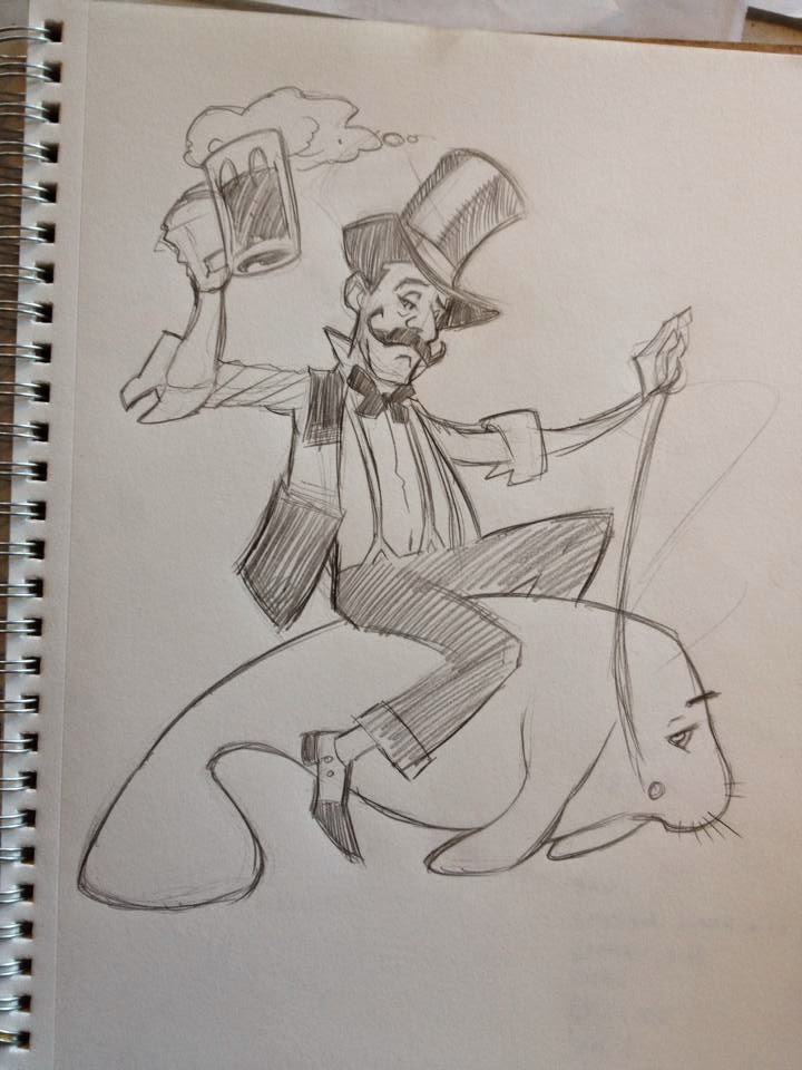
I really thought he needed a hat so added this in this version which the client loved and cleaned up the design, silhouette and pose.

The client, after having a talk with the other owners, decided that the manatee element wasn't the direction they wanted to go and asked me to try having him riding a keg of beer instead.


So, I sent them this version-riding the keg of beer and adding another pint of beer to the character now that the reins were no longer needed for the manatee.

They loved this so I moved forward with the inking of the image.


I inked this with (mostly) crow quill with a number 2 nib to create a "hatchy" victorian style illustration.
The client loved the inked version so I moved forward to finishing the graphic by adding a logo.
I chose a font that I thought matched the style and energy of the illustration.


And here is the final image:)
Totally fun to do and the client was super happy with the final image.

I like to show my process on stuff like this to continue to blow up the idea that artists and designers just "poop" out their images without any preliminary thought, work or exploration.
Sometimes you get lucky and crush it with your very first idea and concept but often a certain amount of development and refinement has to be gotten through before you arrive at a finished image.

Thanks for looking!

T.

Wednesday, October 15, 2014

Plein Air Drawing

For my COS drawing classes. Some nice examples of plein air drawing. Please notice all of the great shapes and textures that help tell these individual stories.


Tuesday, September 3, 2013

Wow! 
It has been a long time since I have been on here:)
In an effort to help students understand the process of drawing, I have created a series of images that depict the different steps that I go through in the development of a drawing. In this instance, I have created a portrait in graphite. This is by no means a finished drawing nor is it meant to be held up as an exemplar of a perfect portrait. This is simply meant to be an example of the linear progression of my process in chasing the truth in my subject:)


Step 1 Gesture
Quickly executed gesture. Long angular lines. No thought to the subtle nuances of the 
silhouette. Just trying to capture the basic shape and the general placement of the features.
Treating the shadows as simple shapes.


Step 2 Gesture Refinement

Slight adjustments are made to the contour and the placement of the features. The long angular lines are broken into shorter and more specific angles, but are still kept simple and angular. Some suggestion of line weight (ie soft lines for form shadows, hard lines for cast shadows) is used in describing form.


Step 3 Erase out and describe drawing as a quality of light.

The original drawing is lightly erased out leaving just the "ghost" of the original marks. A "shadow map" of the subject is created. My goal is is to treat everything as a quality of light. All I am doing here is describing shadow shapes. Still no value. Slight adjustments to the contour with continued refinement of line quality in the attempt to describe form.


Step 4 Flat Value

A flat, uniform light value is applied to all shadow areas. The quality of line in regard to the shadow shapes is maintained. Form shadow lines still soft and cast shadow lines crisp. The directionality of my mark making in the area of value is consistent. No scribbling or hatching.


Step 5 Refinement of Value

The development of the value progresses in a series of light hatchings. The pencil should just "glaze" the paper. Building of value is slow and incremental. Constantly comparing value to value. I am asking myself where are my darkest darks and where are my lightest lights. Continued small refinement to the actual shapes of the shadows as the value is explored.


Step 6 Continued Refinement of Value.

Here the geometric feel of the shadow shapes begin to feel a little more organic. Again, the building of value is slow and always comparative.


Step 7 Widening Range of Value.

The range of value is more widely expressed. The halftones begin to be established as the transition between highlights and shadow. Form begins to be described more accurately.


Step 8 Continued Expression of Depth of Value

Here the halftones are more fully developed to firmly describe directionality of light and form. Though the range of value  is widened the range is only 5 steps. There is no white and there is no black. At this point, my goal is to start having a "sculptural" feeling to the drawing and hopefully the illusion of three-dimensionality begins to be expressed.

Tuesday, April 23, 2013

I also just finished a great SuperheroYou illustration for my wonderful niece Aislyn for her Birthday! Yay!

Time to update ye olde blog with some recent images:) Here is a superhero avatar I finished for the amazing Lauren Lapointe, up and coming singer songwriter based out of Savannah, Georgia. She used this image of the cover of her new CD, "Superhero".
Really great person and a great talent! You can check her out at www.laurenl.com


Sunday, April 21, 2013


Friday night was the opening of the gallery show for the ATMP, Artist Teen Mentor Project, at the Rogue Gallery in Medford. Such a great program and the three teens I was lucky enough to mentor worked incredibly hard and created some amazing work. I am super proud of these three young artists and if you find yourself in Medford over the next week I hugely encourage you to visit the Rogue Gallery and Art Center and have a look at all of the amazing student work!
Awesome job, Luis, Ariel and Melora! Congratulations Team Awesome:)


Friday, May 25, 2012

So....
I just finished a fun commission for a really cool woman, Veronica, who wanted an image of herself and her husband to be as Wonder Woman and Superman as a wedding gift. I thought it might be fun to post the entire series of drawings I did in the development of the final image to show my process:) As always I would love to hear what people think!

Initial thumbnail.


Veronica left it wide open as far as what I could do for this image and this was the first thumbnail I sent her. She loved this pose so I began to refine the drawing.

More refined drawing


In this tighter drawing I began to tweak the anatomy of the figures and spent some time trying to figure out the structure of the male characters forearms which ended up being pretty tough. I also adjusted the legs and feet of the female character to make her look more joyous and happy:)
I also began to suggest clouds and think about this image as a complete composition.


More refined drawing still!

In this version I spent some time refining the hands, expressions and costume details. I also added the date of the wedding to the image. I noticed in the previous version that the male characters head and neck looked a little skinny so I adjusted it somewhat. Still working on those forearms:)

Even more refined drawing:)


Detail, details, details:) Just little things with the expressions, hands and costuming details. His shoulders still didnt look quite right and I thought his upper legs looked kinda bulky. And also her lower foot looks weird, right? The forearms were driving me crazy!! I was literally standing in front of the bathroom mirror holding three pillows to my chest to try and see what this should look like!
Yes.... this is my life:)

Final pencil drawing!


So here was the final pencil version, highly contrasted prior to being printed in duotone for inks. Got the forearms sorted out and the Superman logo on the cape. Slimmed down the legs a bit, by adjusting the slopes of the quads and hams, and got the lower foot straightened out! Put some shadowing on the males back and on the soles of his feet. I tried not to have too much black in this image because of the happy and joyous nature of the image but I like s little spot black just to give the eye visual hooks to move around the imag and to give the process of "looking" at the image a certain tempo. I feel that the eye slows for areas of high contrast and detail so using these elements help dictate the way in which a viewer "reads" an image. 

Final image:)

And here are the final colors:)

Realy bright and mostly primaries. 
The color story is bluer and slightly darker at the bottom of the image as the two characters lift up into a brighter and oranger sky. The two face, if you look closely are being highlighted by each other to suggest love and happiness:) AWWWWWW!!

The darker clouds below them also help to suggest the visual narrative of the two characters embracing and rising above and danger/unhappiness/rainy days etc.


So this was it! Really fun project and I was happy with the final product as was my amazing client!

If anyone has any questions or comments on what I have done here please feel free to comment or connect with me at ted.helard.com

later, skaters:)