Sunday, December 6, 2015

Thumbs for Artemis IX

Hello!
I have finally started moving forward with my sample pages for the Top Cow Talent Search 2016. My teaching schedule kept me from starting as early as I wanted to but I have now finally found some momentum:)

I thought I would post 4 of my my loose thumbnails from the 8 pages then post my roughs and then the tight roughs and talk about my process and why I go about pencilling pages the way that I do.

Loose thumbs Page 1


Page 1 consists of an establishing shot in panel 1 and a closer shot of Artemis IX's tower showing damage to the building in panel 2. The third panel is an interior shot depicting the work being done to the building and introducing Artemis IX, Brauron and the two female artists.

When I do these thumbs I do 8 of them on an 11 x 17 sheet of bristol. Each thumb is only about three and a half inches tall. I try to do these as quickly and as gesturally as possible referring back to the quick layouts I did when I first read the script. All I'm thinking about here is story-telling, shot selection and being mindful of creating deep space. I also have given some thought to establishing the directionality of my light source just for fun:)


Same thing here. Super quick and gestural. Mostly just stick figures. Keeping my eye on the left/right orientation of my figures and making sure everybody is staying consistent. 


And same thing here...


...and here. 

When creating thumbnails I try very hard to keep them super loose. I keep my body upright and relaxed and keep my hand quick and gestural-drawing from the shoulder. No laboring over any drawing, here, just the simplest of sketches to tell the story. 

It took me about 20 odd minutes to thumbnail all eight pages. I went back and looked them over and felt that I was ok with most of my choices. I scanned them in preparation to creating the next stage of roughs. 

I'm not really one of those comic artists that can jump right into the full sheet of bristol and start creating finished pencils. I admire those that can. My process can be somewhat circuitous but I find that I get less stressed about the work and am way more relaxed and loose if I start small and simple first. 
Because the thumbnails are done super fast I am uninvested in them and can just allow them to be dorky and experimental. 

In my next post I will talk about the next stage in my process and the changes and choices I made in trying to improve the storytelling and look of the pages.

Until next time~

T


Thursday, October 8, 2015

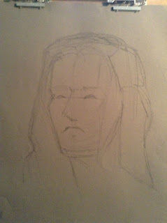
Process in portrait drawing.

Taking a break from the development of my sample pages for the new Top Cow talent search, I thought I would post some images of my process for a current portrait I have been working on.

I like to show the process to my work as it gives students insight into the many steps that it can take in building a finished drawing.

Step 1. The gesture. Quickly executed 20-30 second drawing


Step 2. Refined gesture. Slight refinement of gesture and suggestion of shadow shapes.


Step 3. 

Continued refinement of shapes and adjustment of proportions and placement.


Step 4. Here I start picking out some of the lighter values still thinking about adjustment
of proportions and designing shadow areas


Step 5. Continued exploration of values.


Step 6. I realized I had goofed up the mouth shape and also the eye placement so I lightly erased out and began to rebuild. I also began sculpting out the hair.


Step 7.  Here I began to try and express the range of values in the entire portrait and unify the image.

Step 8. And now even wider expression of value.


Step 9. And even wider expression.


This is not finished but I am starting t feel that the values are looking unified and that the shapes are starting to agree. So much of what happens at this stage is subtle adjustments of value and quality of light.

Monday, October 5, 2015

Hello again!

Before I start thumbnailing a project I like to to get any needed concept work done and also gather any needed reference. As time as gone on I have gotten away from using reference and tend to just make up everything that I draw. However, as this story is set in an already established world I will ned to make sure that the visuals I create dovetail into this continuity.

Here is the list of needed reference/concept work I put together for myself.

Needed Reference for Artemis IX 8 page sample for Top Cow

1.     Artemis’ City – check IXth Generation # 3 Vertical masculine city lots of angles.
2.     Damaged building-explosion again check IXth Generation # 3
3.     Inside damaged building again check IXth Generation pages 17-23
4.      Male/Female cyborgs. Females scantily dressed. Males are workers-construction.
5.     Sculpture reference for Artemis sculpture
6.     Bauron – Male Cyborg
7.     Computer Tablet
8.     Large Scale painting – Easel
9.     Chione attractive medium brown hair with blonde streak
10. Artemis’ private office. Desk/lighting/chair/decorations
.
11. Artemis’ shuttle. Like a cross between an X-Wing Fighter and a Colonial Viper with touches of an F-14 Tomcat. It’s a two-seater with a canopy
12. Hanger – assorted stuff/workers
13.  Mechanic
14.  Cockpit of Shuttle – Navigator/computer
15.  Building explosion caused from crash with shuttle
16. Exploding glass
17. Torn Clothing/Jacket
18.  More friendly looking shuttle
19.  Artemis’s quarters.
20. Massage table

I do this just a starting point and to not jump the gun and draw myself into problems later in the process.

Once I gather any needed reference I will start doing my concept work for all primary characters, environments, interiors and props.

As I have already started some concept work I will be posting some images later in the week:)


Saturday, October 3, 2015

Process in creating my submission for the "Top Cow Talent Search 2016" - step one "The Script"

Hello!

I have recently begun the process of creating 8 sample comic pages for the 2016 Top Cow talent search contest. In essence, Top Cow provides a selection of scripts that the hopeful can choose from to create sample art. These submissions will then be vetted by the fine folks at Top Cow and 2 winners will be chosen from the best examples.

Anyone who is interested in finding out more details about this talent search can follow this link.


I have decided to detail my process in creating these sample pages to give an insider's look into how I create the work I create and my thought process behind what I do. 

Lucky you:)

Firstly I will post the 8 pages of the script I have chosen  They are from the first issue of Artemis IX. I liked this series of pages because there were multiple environments, lots of different characters and several great scenes that I thought would be a lot of fun to draw. When I read the script I began to see in my head how the pages would go together-always a good sign.

On these pages you will also see my quick notes to myself about the panels I felt were the "pay off" and "page turners" for each page. 
By doing this I am making decisions about what panels should be the most important on the page. It is all part of composing the page. The "payoff panel" should reward the reader for continuing to read by being extra exciting, dynamic or beautiful to look at. It is also usually an important scene in the advancement of the story. The "page turner" is the panel that keeps the reader turning pages. A very important consideration in the making of comics. This panel should create some form of drama, intrigue or suspense that encourages the reader to turn the page to find out what happens next.

Here are the eight pages-


Now that I have perused the script and have made some very beginning choices regarding layout of my work I will move to the next stage of gathering any needed reference. I like to do this before I begin to do thumbnails as it helps me to have a clear idea of what my characters, environments and objects are going to look like as I find this understanding guides my storytelling to a certain degree. As these comic pages are samples based on existing characters in an existing world I need to make sure that I am careful to be very aware of how these elements should be depicted and not draw myself into mistakes that will cause problems in later stages of the work.

Check out my next post to see what I come up with!

Thanks all!!

T.


Sunday, July 12, 2015

I originally did a version of this comic when I was in Cartooning 1 at SCAD but I lost the original. I've always wanted to redo it so here it is:)

Monday, April 6, 2015

New comics!

Comics Weekly, a new weekly comics magazine, will be publishing some of my comics so I thought I would post some of my new strips:)


-just a great excuse to draw myself in a batman costume:)


Hello everyone in the internet land:-)

I thought I would post quickly about a recent image I designed for a client in Florida. One of the owners of a new bar, The Village Idiot Pub, hired me to create a graphic for their new business.

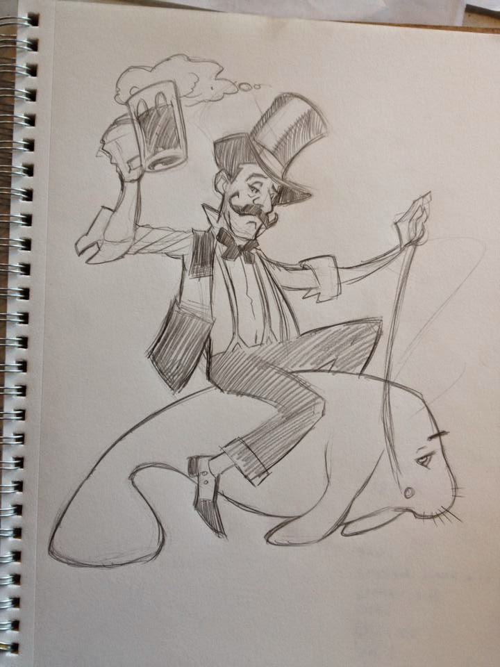
He told me that they wanted wanted a victorian style pub goer riding a manatee

I sent him a quick sketch, that I think I drew on the back of an old envelope, and sent him a quick picture to get his thoughts.

When I do these I am always thinking about silhouette and how well the image reads.


He liked the initial idea but thought he should have a beer in one hand so I sent him this


I refined the character a bit and added the elements that the client wanted.

They felt that the wanted to see a more classy looking pub goer so I put together a new sample and sent this off.


They greenlighted this version so I developed it into the next phase. -I try to keep these early versions as simple as I can to keep my hours under control and not over commit creatively or energetically to a beginning concept.


I really thought he needed a hat so added this in this version which the client loved and cleaned up the design, silhouette and pose.

The client, after having a talk with the other owners, decided that the manatee element wasn't the direction they wanted to go and asked me to try having him riding a keg of beer instead.


So, I sent them this version-riding the keg of beer and adding another pint of beer to the character now that the reins were no longer needed for the manatee.

They loved this so I moved forward with the inking of the image.


I inked this with (mostly) crow quill with a number 2 nib to create a "hatchy" victorian style illustration.
The client loved the inked version so I moved forward to finishing the graphic by adding a logo.
I chose a font that I thought matched the style and energy of the illustration.


And here is the final image:)
Totally fun to do and the client was super happy with the final image.

I like to show my process on stuff like this to continue to blow up the idea that artists and designers just "poop" out their images without any preliminary thought, work or exploration.
Sometimes you get lucky and crush it with your very first idea and concept but often a certain amount of development and refinement has to be gotten through before you arrive at a finished image.

Thanks for looking!

T.